This assignment was about life in color or through abstract photos. I chose to do color because I liked the idea of color more, and I thought that my better judgment lied there anyways. We were tasked to take at least 50 photos and choose the 5 we thought were best.
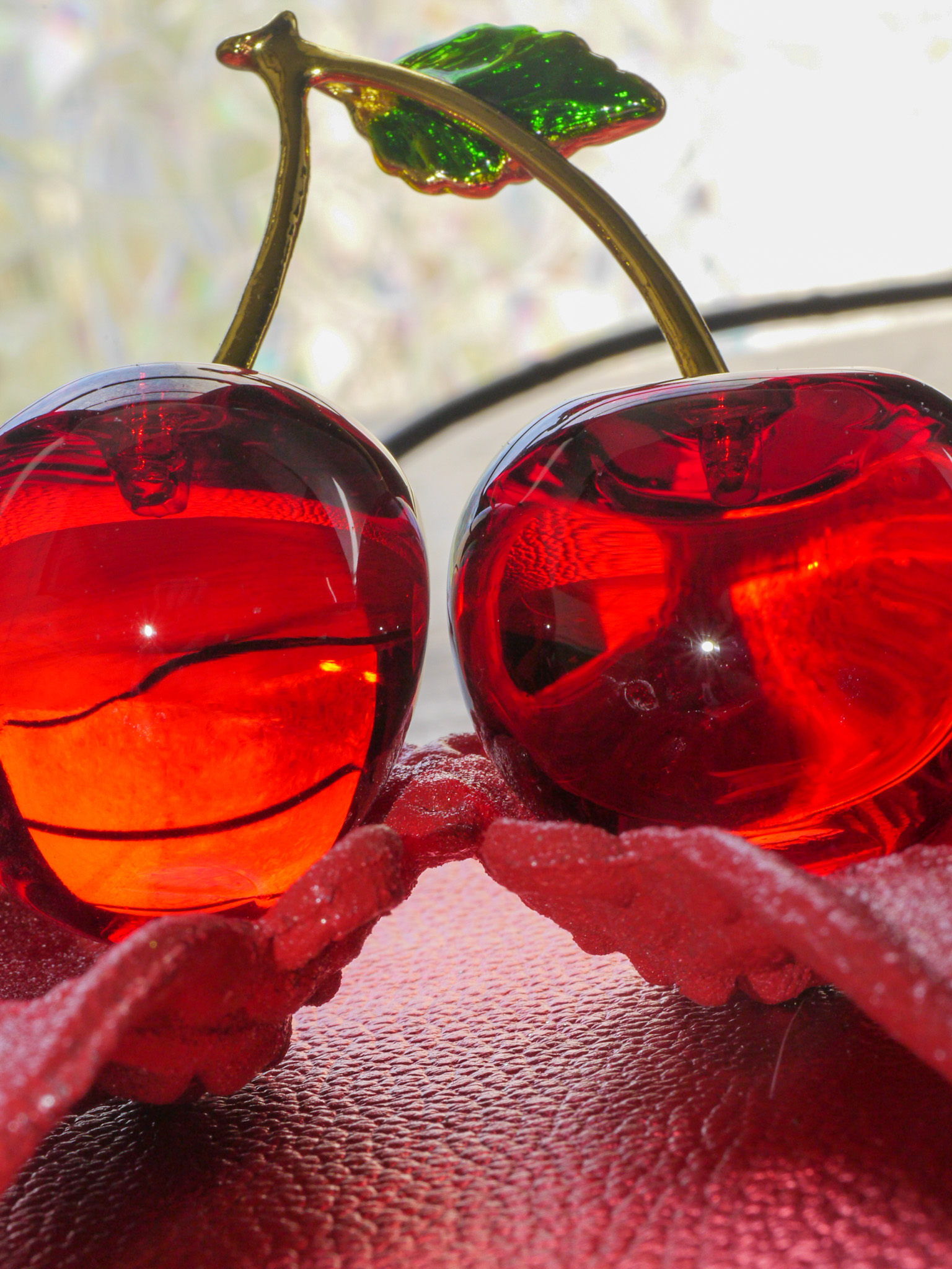
For this photo, I used a pair of red glass cherries, a red-painted pair of wings, and a textured background paper (red). I laid down the background paper and placed the wings in the middle, and put the carries in the wings. I also used natural lighting to make the color of the cherries pop out more and look more transparent.
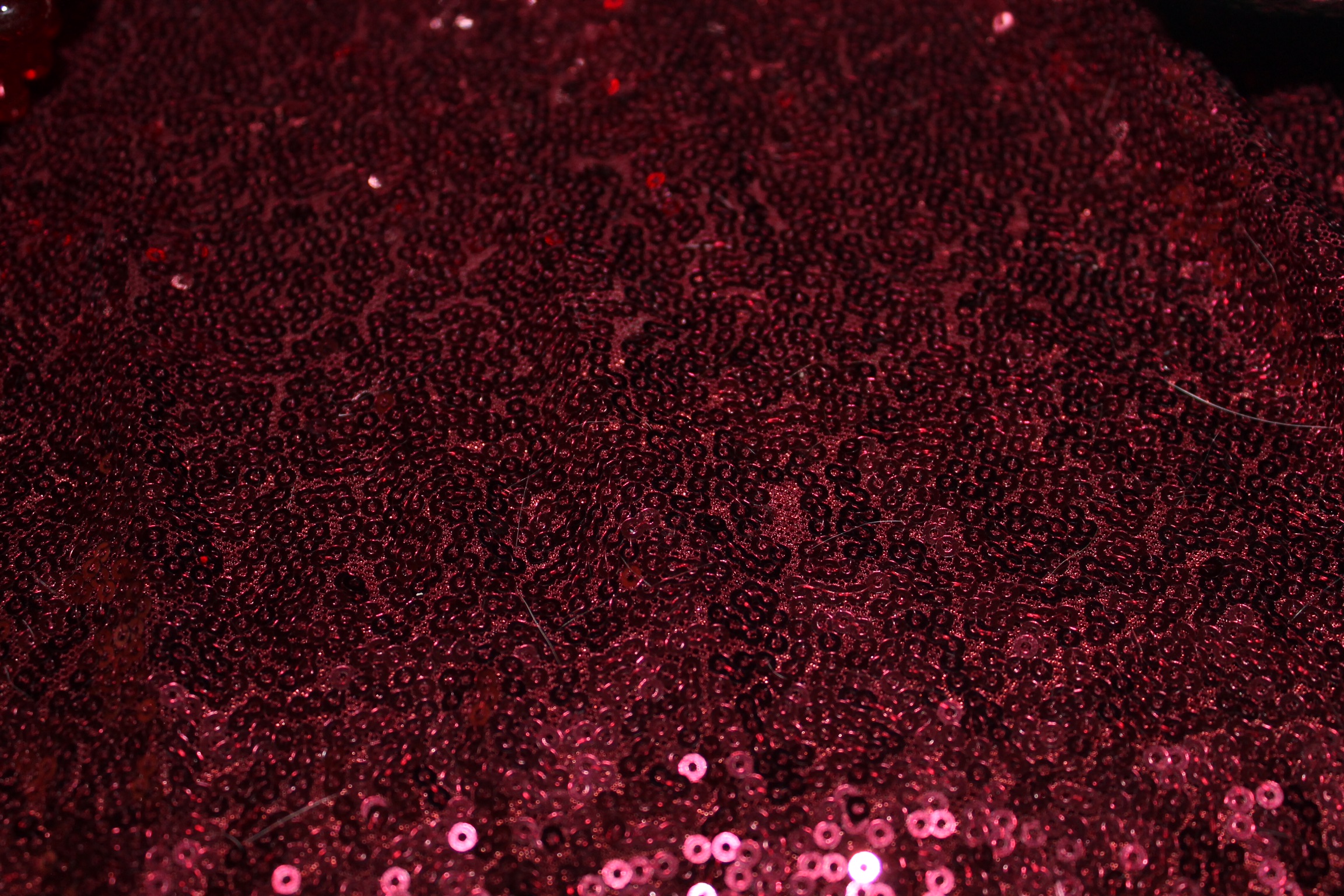
For my next photo I used a red throw that had these little things on it. The blanket was red and had a nice texture for a photo, so I dampened the lighting to get a dark cherry red and to get an effect where you look towards the bottom of the image and the image becoming lighter.
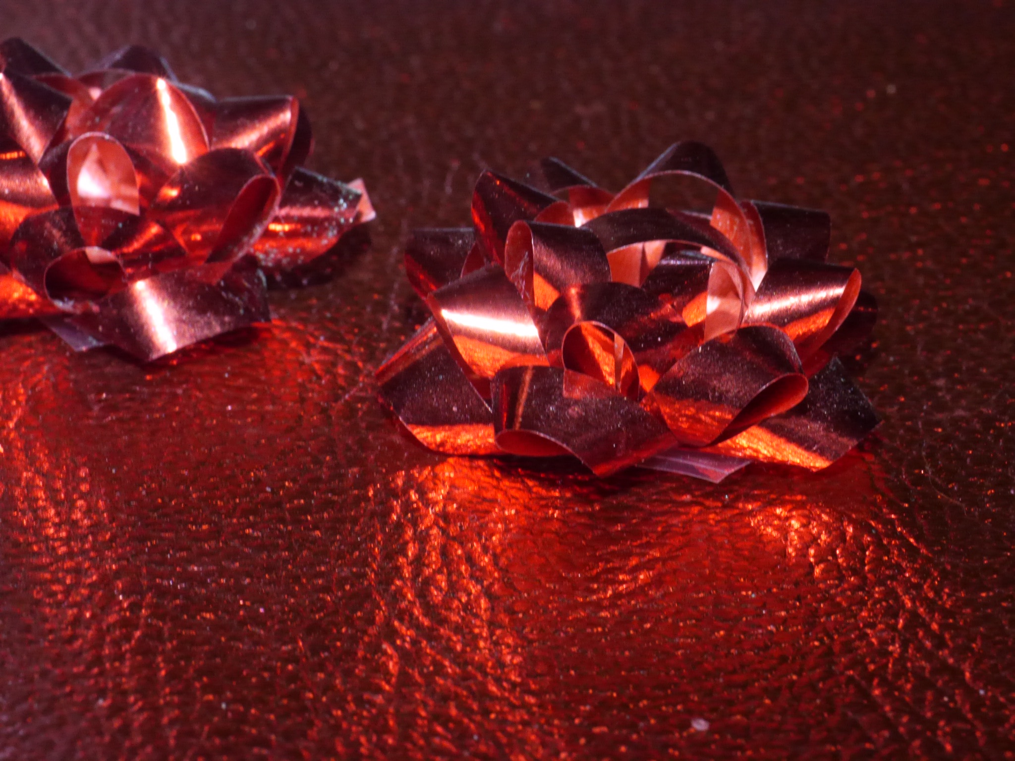
As for this photograph I used two red bows and the same textured background I used in the first image I presented. I placed the bows diagonally from one another made the lighting come from the front more; I did the lighting to experiment and see how the photo would come out and enjoyed this image more than it’s much more dimely lit twin.
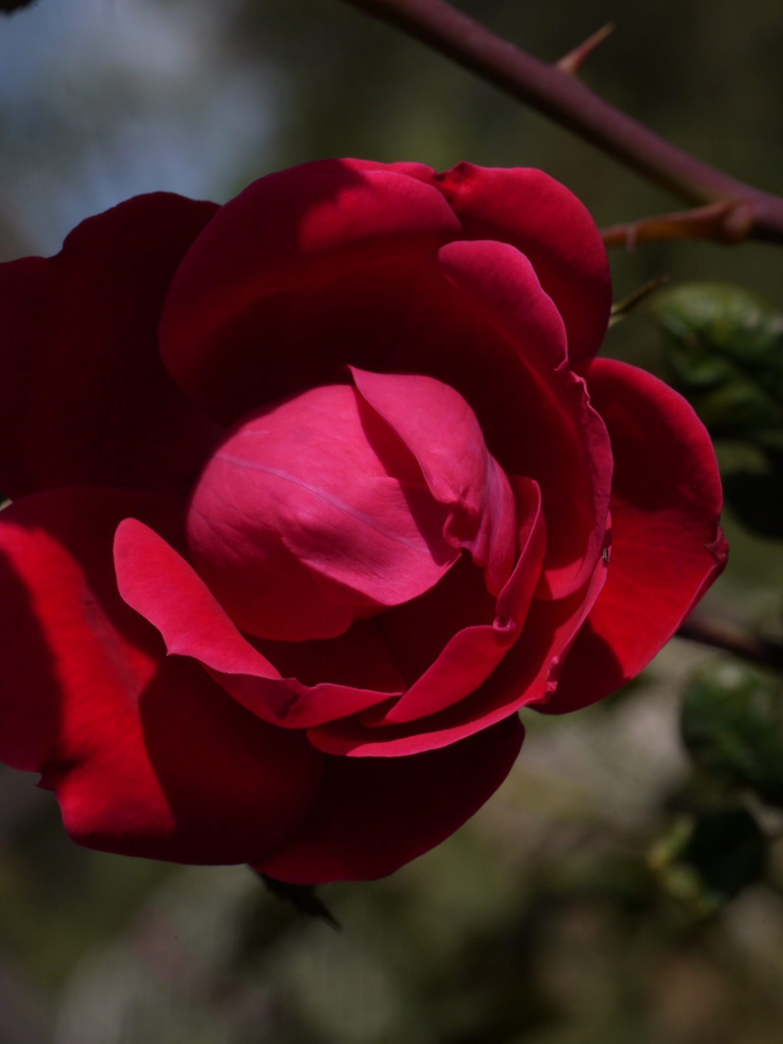
In this photo I used a rose from our rose bush. I angled myself to see it’s beautiful petals more clearly and dimmed lighting just a but because if the lighting was any more of the rose would looked like a cross of pink.
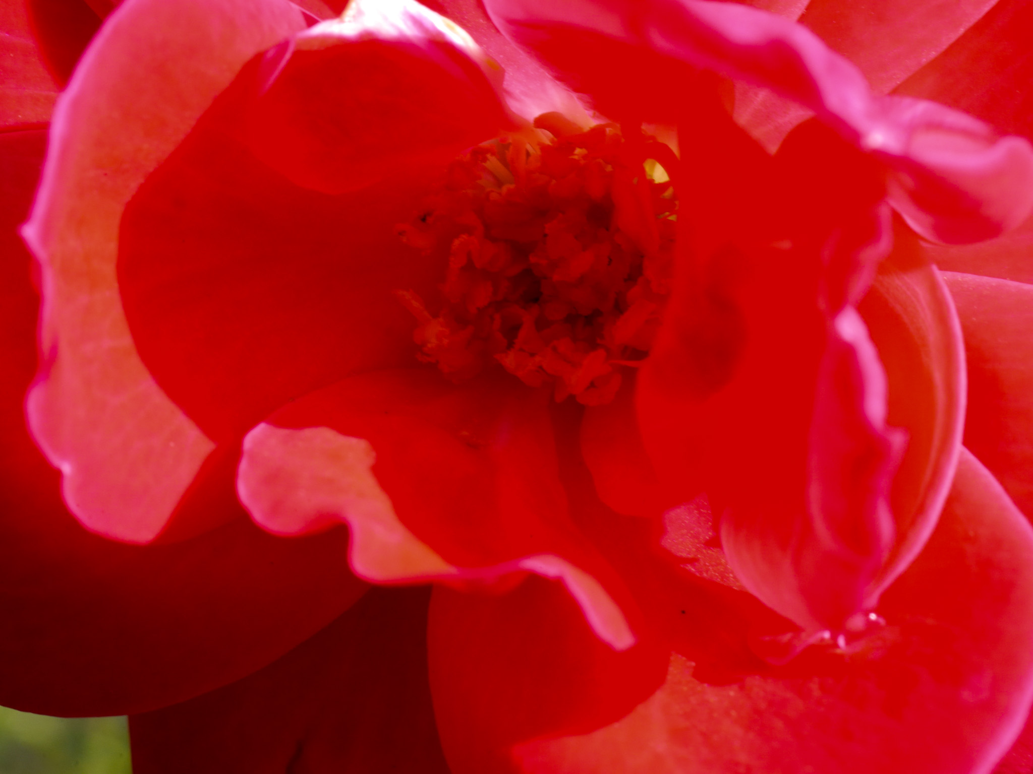
For my final image I used another rose from our rose bush, but I used a blooming rose. I was able to use natural lighting to my advantage and I was able to get a picture of the inside of the bud without having to go back and edit the photo much.